I’m passionate about UX, Design, and Marketing because it all aligns with what I do best. I understand people’s motivations and feelings in different settings. I can quickly put me in others’ problems, which helps me come up with the best possible solutions. I’m open to exploring new experiences and ideas, and always ready to increase my knowledge.
Scroll down to see samples of my work.
Kitchen Magic
I was a major contributor in Kitchen Magic’s Campaign for scheduling design meetings.
In this project, I used my background in UX design to research, prototype, and develop the wireframes for which the team ended up using their design…as well as provided the content strategy for addressing each need in the user funnel.

Below is an image of the original ad with the unedited proposed copy, and a new version I created with edited/revised copy and improved design and layout.


Below is a screen shot of a bit of the process on Figma working on a 40% off Memorial Day Sale for Kitchen Magic.

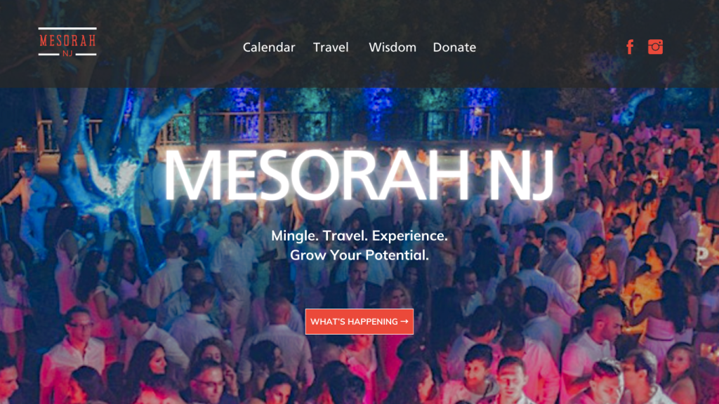
MesorahNJ Landing Page
Landing page encourages the user to see “What’s Happening” if they do not know which menu item to explore.
The voice is confident, encouraging, and friendly. The tone is instructive and conversational.
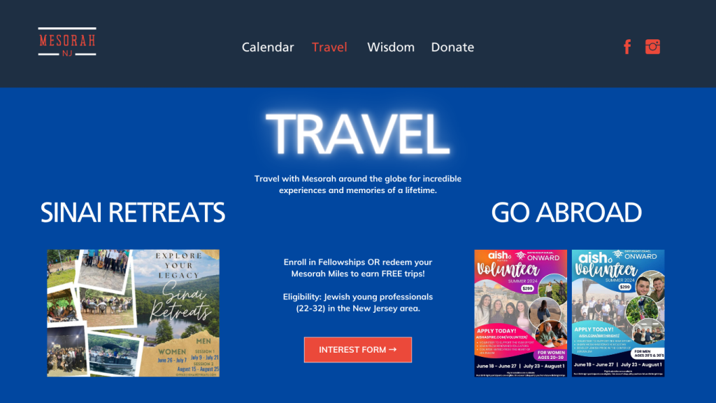
MesorahNJ Travel Page
This page shows the user a couple options for upcoming travel opportunities and reuses images found on social media for better branding and recognition. The communication is clear and the user is encouraged to interact with the Call To Action!
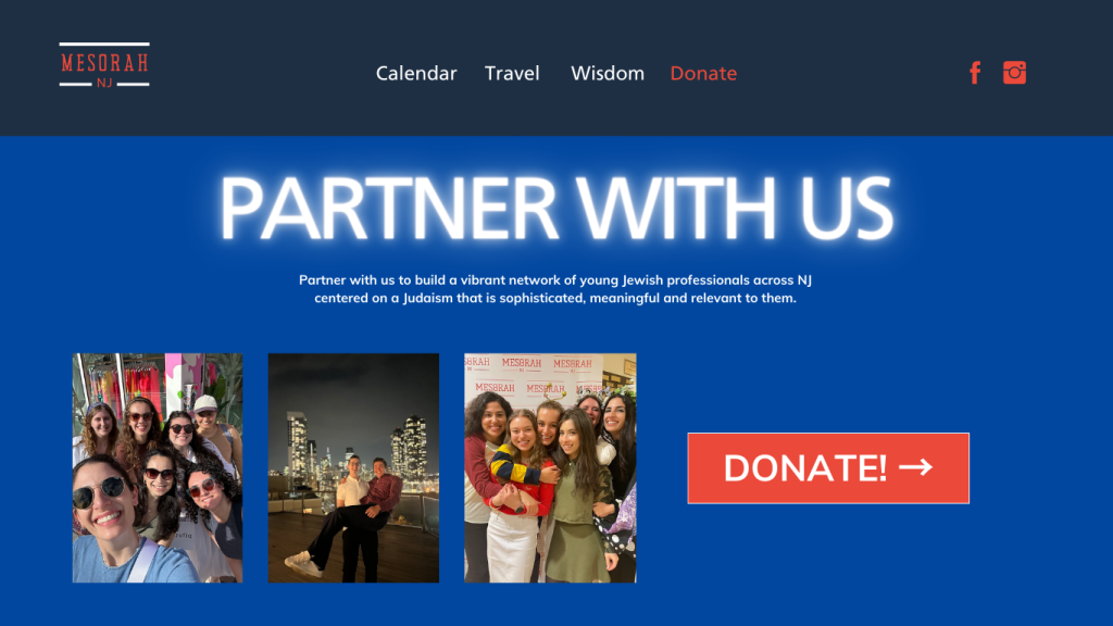
MesorahNJ Donate Page
The language used here is friendly and instructive for the user to feel they are partnering with an organization to support the cause/mission stated below the main text. The Call To Action is clear, so the user can feel confident navigating the page and make a donation with little to no confusion.
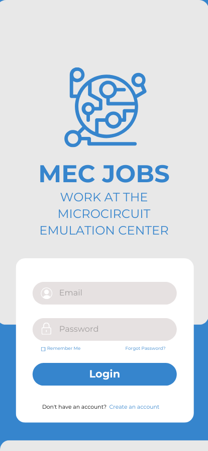
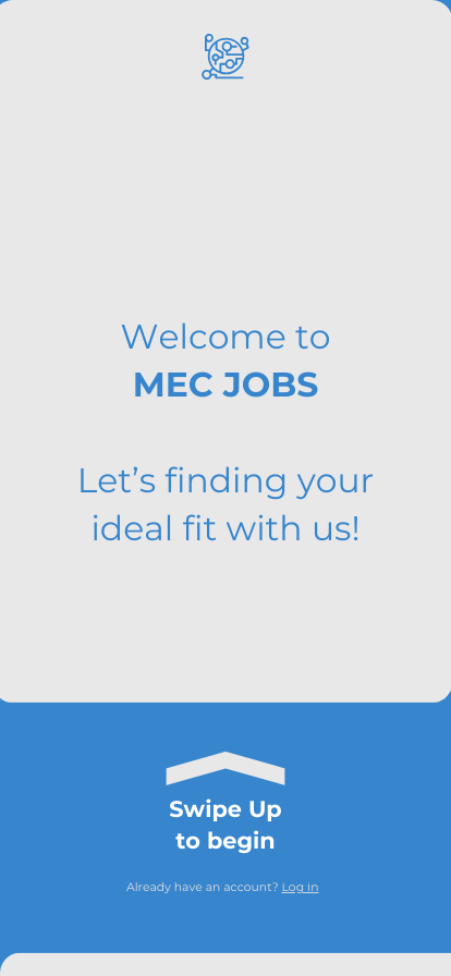
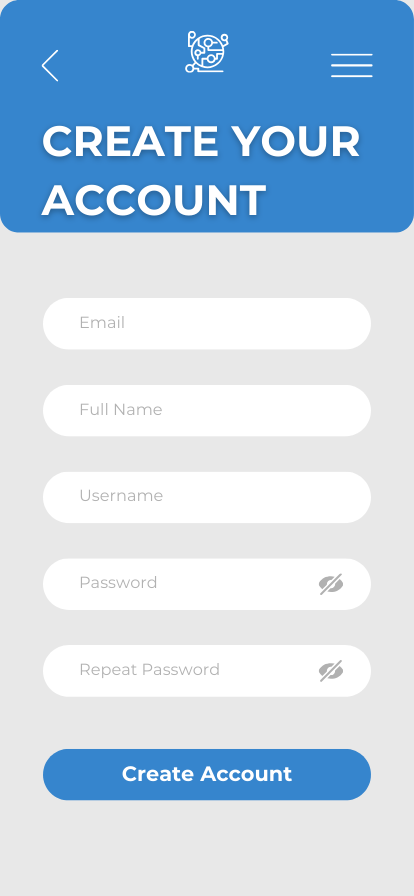
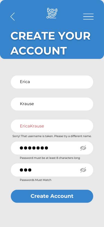
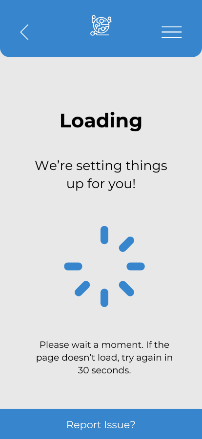
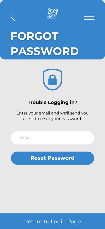
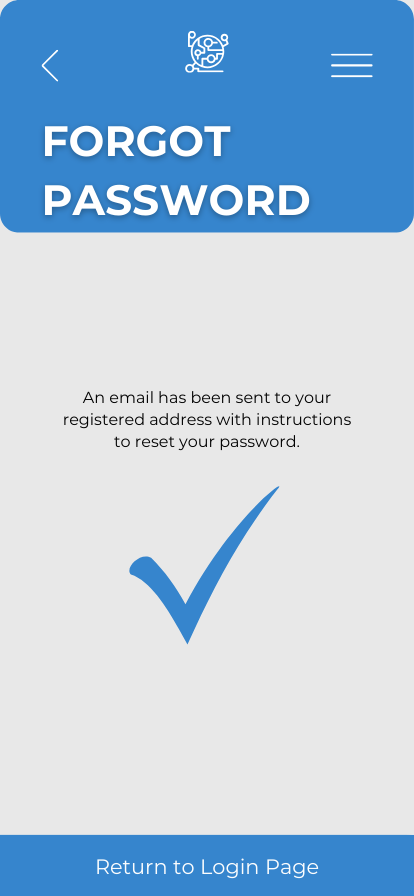
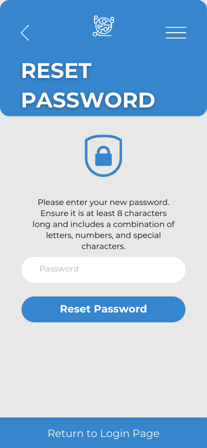
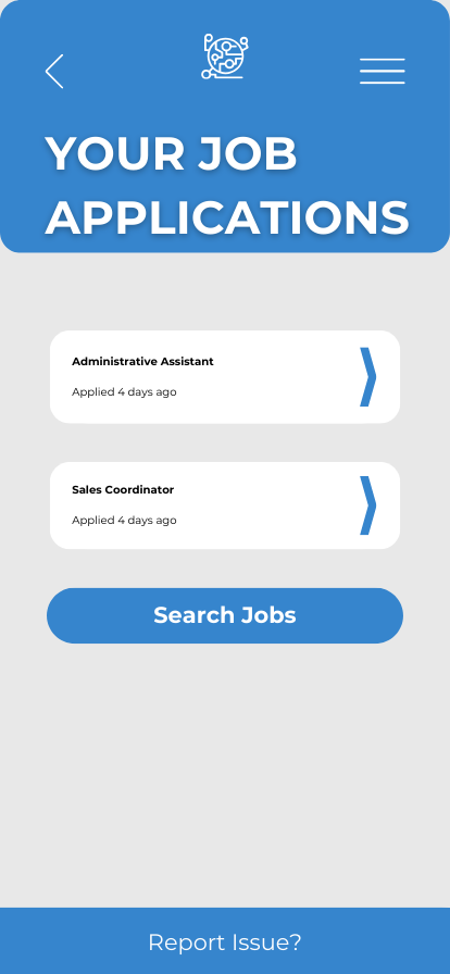
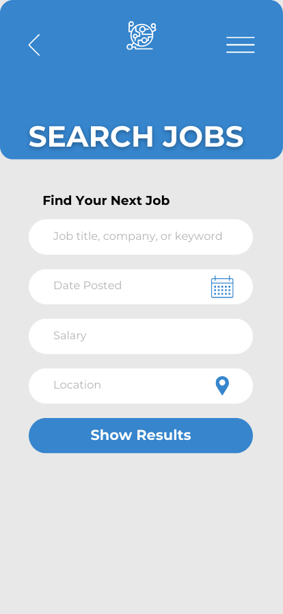
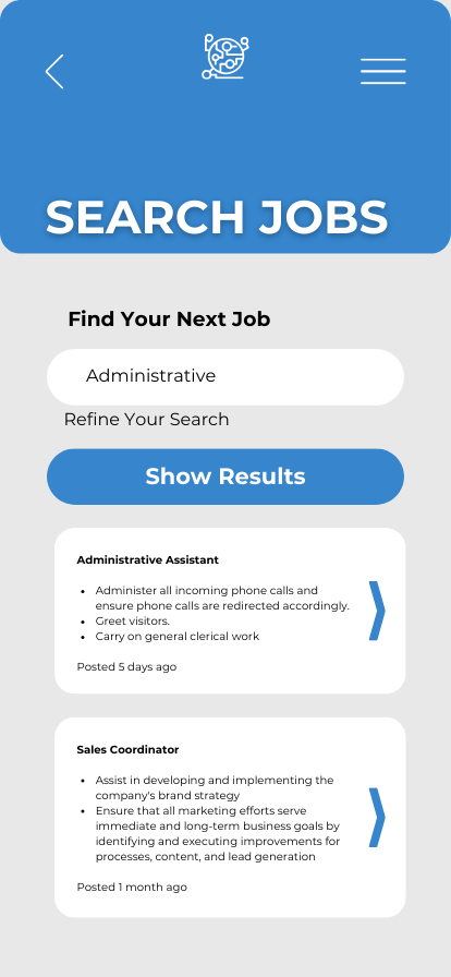
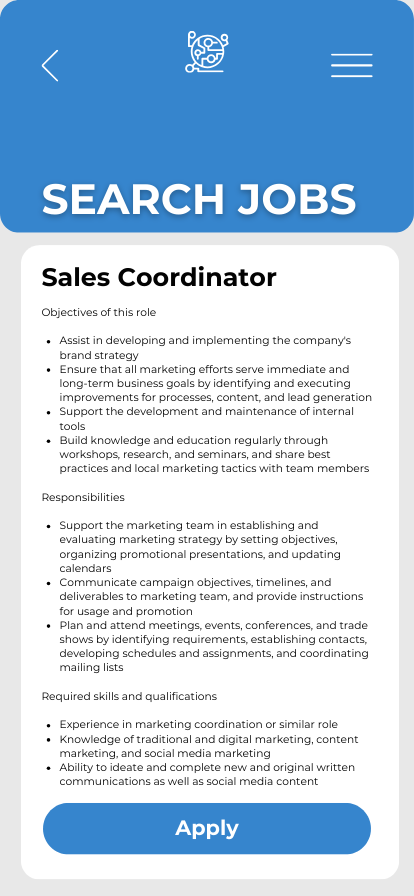
MEC Jobs App
I created an app for SRI International’s Microcircuit Emulation Center to connect with talent for job openings.



UX Writing Voice & Tone Samples
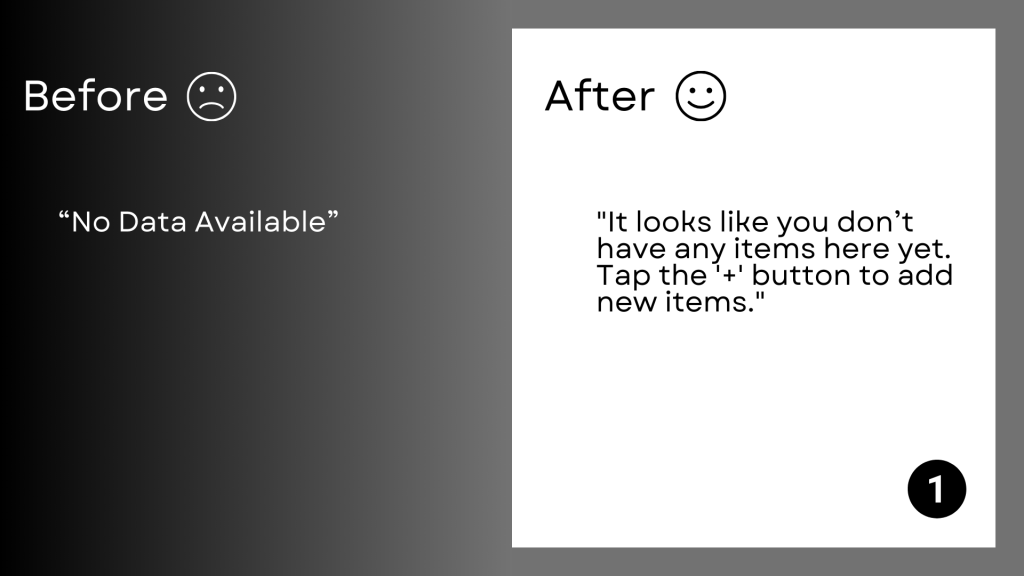
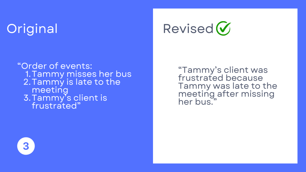
I recommend voice attributes that focus on clarity and usability. Here are some before/after examples for error messages:
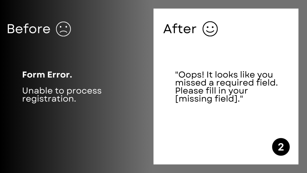
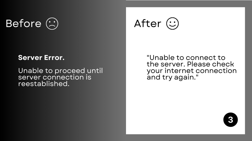
- Clear and straightforward, but not terse or dry
- Conversational, but not overly familiar or young
- Focused on action, but not overbearing
Proofreading and Editing
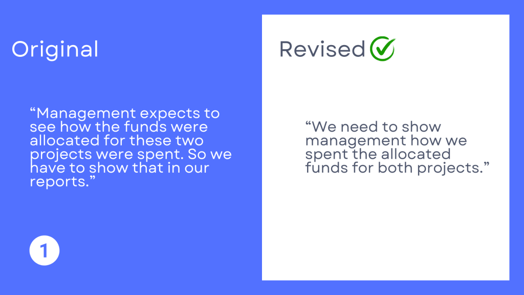
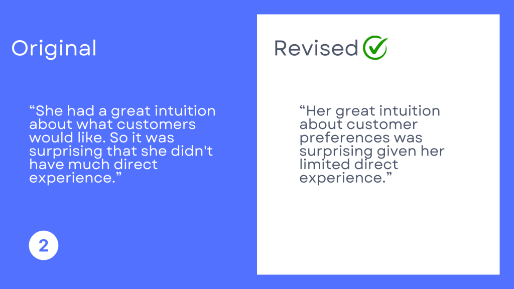
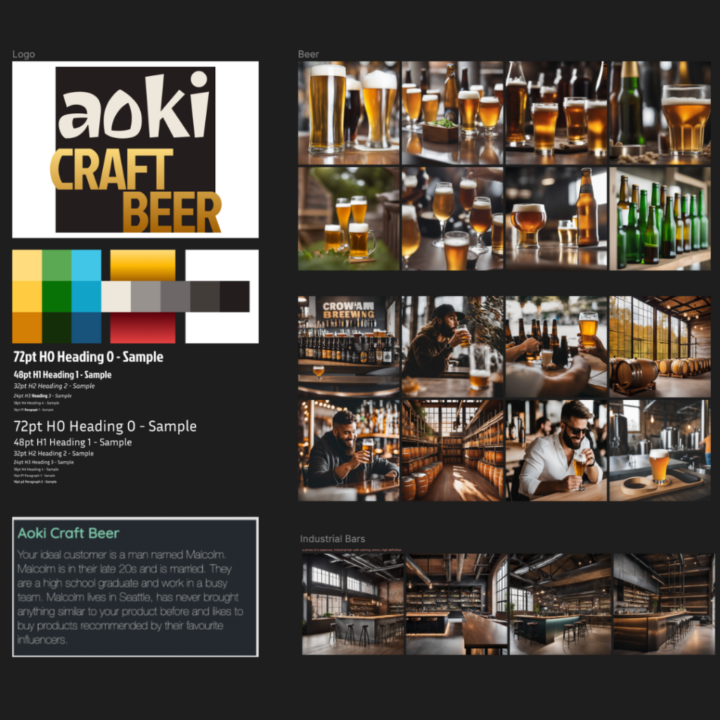
Aoki Craft Beer
This is a product design project using Figma for the following randomized user persona:
“The ideal customer is a man named Malcolm. Malcolm is in their late 20s and is married. They are a high school graduate and work in a busy team. Malcolm lives in Seattle, has never bought anything similar to your product before and likes to buy products recommended by their favorite influencers.”
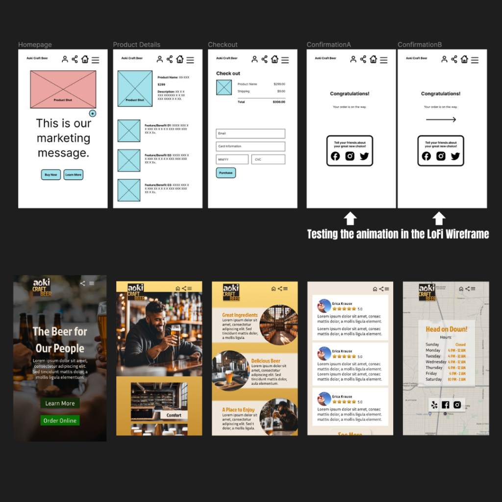
My work includes collaborating with product managers and engineers to gather requirements from users before designing ideas that can be communicated using storyboards.
I create, share, and test designs for websites, mobile apps, and other digital products and experiences.
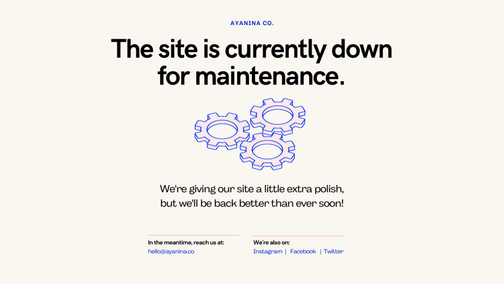
Ayanina Healing
This client received feedback that her site is often down and it loses customer engagement. So I made an empty state page that encourages other methods of reaching out while reassuring clients that the site has not been abandoned and just needs a some maintenence.
Copywriting and Printed Media
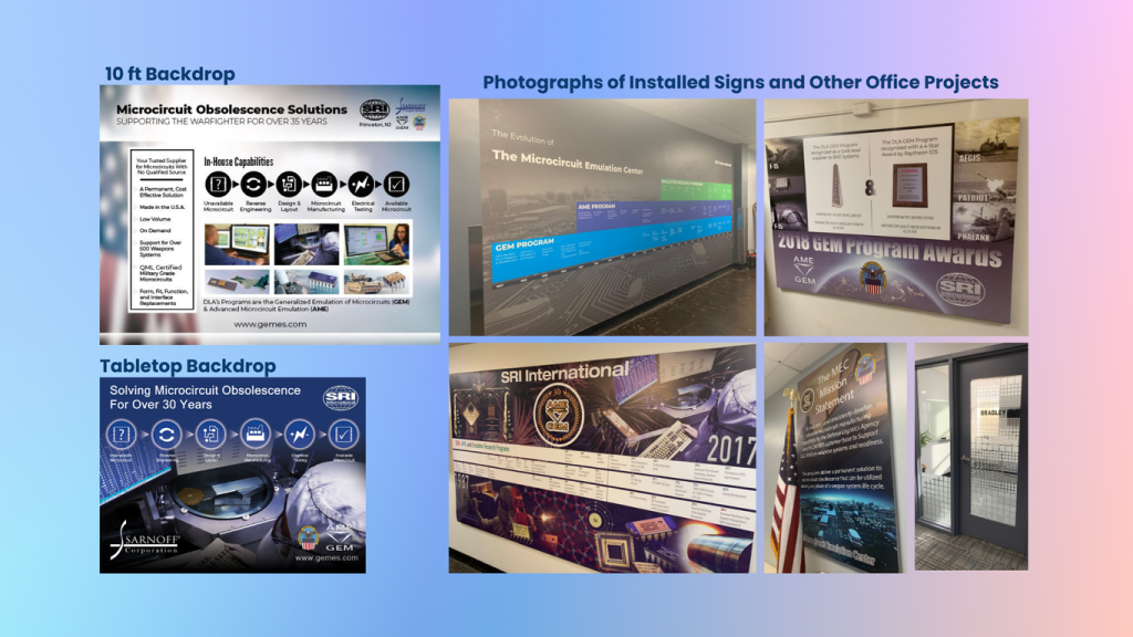
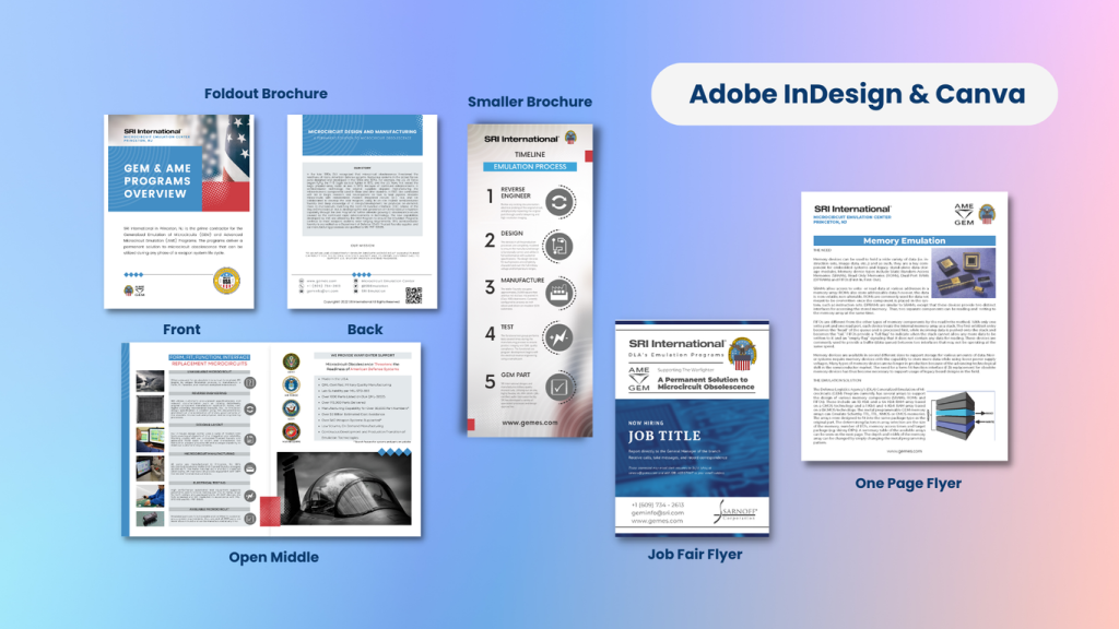
I have created printed media for a number of marketing events in my role at SRI International. I use Adobe InDesign and Canva for various aspects of creating documents and signage.
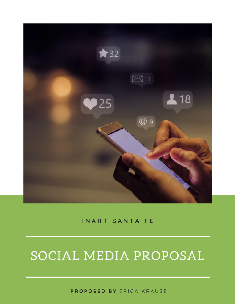
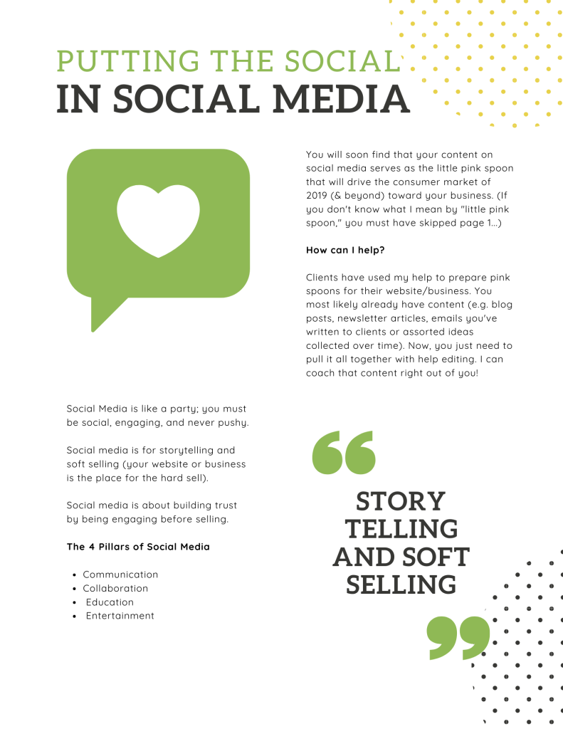
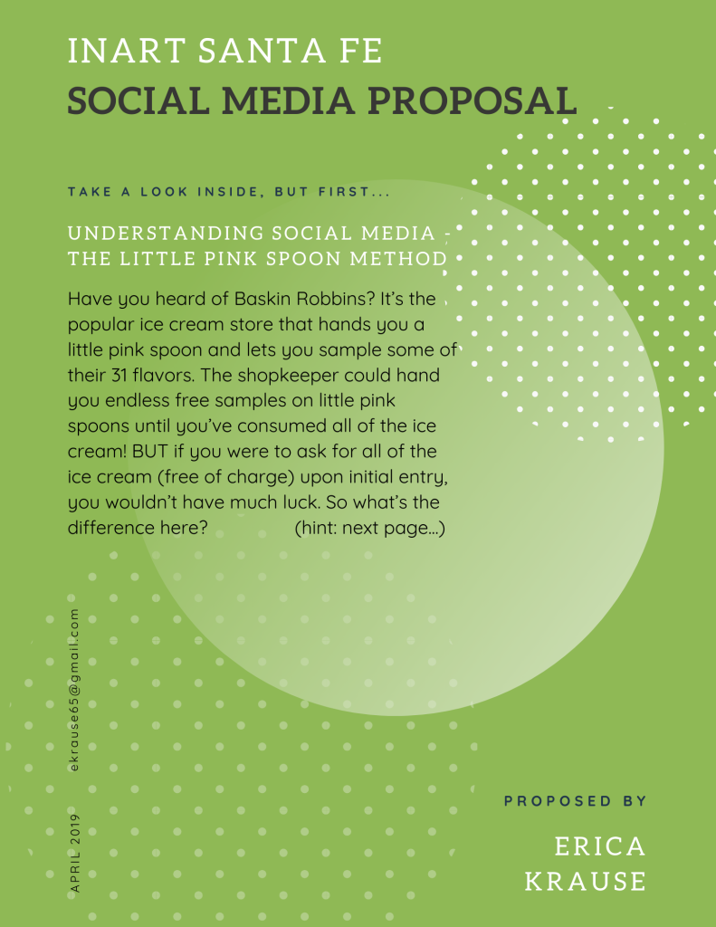
InArt Santa Fe Social Media Proposal
Here is an example of proposal writing for an Art Gallery that approached me about wanting better social media management.
Erica’s Notes and Tips for Better UX Writing
UX writing directs and guides users through your website, encourages user interaction, educates them every step of the way, and helps them easily arrive at their desired destination without confusion.
Tips:
- Clear communication
- Legally sound
- Sound human
- Brand personality
- Humor/Entertainment
- Additional support and helpful error messages
- Pay attention to timing, (i.e. whats going on in the world?). Don’t be tone deaf.
- Motivate users (i.e. encouraging empty state screens and call to actions)
- Be inclusive
- Avoid dark patterns/manipulative design (i.e. hiding the unsubscribe button)
UX writing traps to avoid:
- Don’t use Lorem Ipsum. The shape of the site won’t fit the final text, and you won’t get an accurate response from usability tests.
- Don’t use jargon. Jargon and complex words might slow users down or alienate them.
- Remove unnecessary words that can disrupt the flow of a punchy piece of microcopy.
- Avoid superlatives. Superlatives are rarely accurate, and therefore inspire distrust in your users.
- Don’t blame the user. When a user enters information incorrectly, helpfully explain what they can do to correct it.
- Don’t manipulate the user. (i.e. “Yes, sign me up” and “No, I don’t want more clients” buttons are not okay.)